Reducing customer churn by transforming an overwhelming user experience into a simplified, seamless flow.
The Challenge…
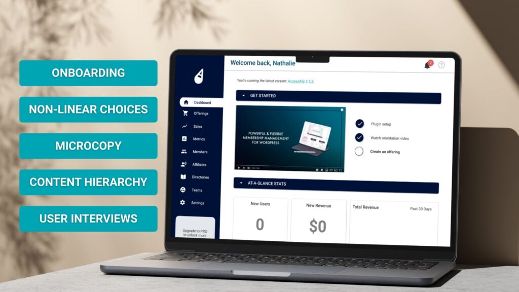
AccessAlly, an edTech SaaS system, was experiencing a critical drop-off in user retention, particularly with newly-acquired clients.
Exit surveys revealed users felt overwhelmed by the significant learning curve, and frustrated by having to configure settings they didn’t understand before seeing any value from the product.
Goals & Success Metrics…
Primary Goals
- Increase onboarding completion rate to 60%+
- Reduce time to first project creation by 50%
- Improve user confidence and product understanding
Success Metrics
- →Onboarding completion rate
- →Time to first meaningful action
- →Week 1 retention rate
- →User satisfaction (CSAT) scores
Research & Discovery
Throughout the research & discovery phase, I worked to ensure that our interviews and user tests covered all three main groups of users: brand new (less than 2 months), certified trained specialists (typically 4+ years), and churned customers. This gave us a depth of feedback that targeted both what caused users to churn, as well as what “worked” for users who stuck around.
Methods:
12 User Interviews
8 Usability Tests
800+ Analytics Sessions
Research Methods
Key Findings
- Cognitive overload: 11-step process was too long; users dropped off after step 4
- Unclear value: Users wanted to “try before configuring” but couldn’t see product value first
- Decision paralysis: Too many settings required upfront decisions users weren’t ready to make
- Missing context: Technical jargon and unclear labels confused non-technical users
Design Process
Based on research insights, I developed a “progressive onboarding” strategy focused on three key principles:
Value First
Let users create their first project immediately with smart defaults
Learn by Doing
Contextual guidance during actual use, not upfront tutorials
Gradual Depth
Surface advanced features only when users need them
Wireframing & Prototyping
I created three distinct flow variations and tested them with 15 users:
- →Option A: Single-step quick start (tested best with 73% completion)
- →Option B: 3-step guided setup (moderate complexity, 58% completion)
- →Option C: Interactive tutorial (engaging but slow, 51% completion)
Testing & Iteration
Through A/B testing with 1,200 users, we refined the winning approach with several key optimizations:
✓
Smart Defaults
Pre-populated project templates based on user’s stated role during signup
✓
Contextual Tips
Tooltips and help text appeared only when users hovered over features
✓
Progress Indicators
Clear visual feedback showing setup progress and what’s remaining (optional)
Key Learnings
- 💡Deliver the First Win Quickly: Users learn best by doing, not reading. The most effective onboarding gets users to their “aha moment” as quickly as possible.
- 💡Question every step: If a step doesn’t directly contribute to user success, defer it or remove it entirely. Less is almost always more.
- 💡Content = design: The words matter as much as the visuals. Clear, encouraging microcopy can reduce friction as effectively as good UI.
- 💡Measure everything: Quantitative data revealed drop-off points we never would have guessed. Analytics + qualitative research is essential.
What’s Next
Following the success of the onboarding redesign, consecutive projects focused on building:
- → Increasing the effectiveness of tooltips by integrating them with our Knowledge Base
- → Building an in-app learning center for advanced feature discovery
- → Developing team onboarding flows for enterprise customers
The Project: